Albany High School Graphic Design
Student Showcase 2007-2022
- A Problem To Solve
- Blend Tool Poster
- Book Covers
- Editorial Clipping Mask
- Editorial Graphic
- Flatten The Curve
- Focal Points
- InDesign Spread
- Pen Tablet Sketch
- Perf Film Windows — C106
- Photoshop Brush Face
- Product Flyer
- Product+Company Mashup
- Signs & Symbols
- Something is Back!
- Spec Ad—Poster
- T-shirts & Apparel
- Text-heavy Billboard
- The Perfect Color
- Thinking With Type
- Typeface Postcard
- Volleyball Poster
- Zachary’s Poster
- Things My Friends Say
- Journalism/Security Free Choice Assignment
- AHS Front Photoshop
- A Problem To Solve
- Blend Tool Poster
- Book Covers
- Brandmark Practice
- Editorial Clipping Mask
- Editorial Graphic
- Flatten The Curve
- Focal Points
- InDesign Spread
- Pen Tablet Sketch
- Perf Film Windows — C106
- Photoshop Brush Face
- Product Flyer
- Product+Company Mashup
- Signs & Symbols
- Something is Back!
- Spec Ad—Poster
- T-shirts & Apparel
- Text-heavy Billboard
- The Perfect Color
- Thinking With Type
- Typeface Postcard
- Zachary’s Poster
- Things My Friends Say
- Journalism/Security Free Choice Assignment
Jayden Allen
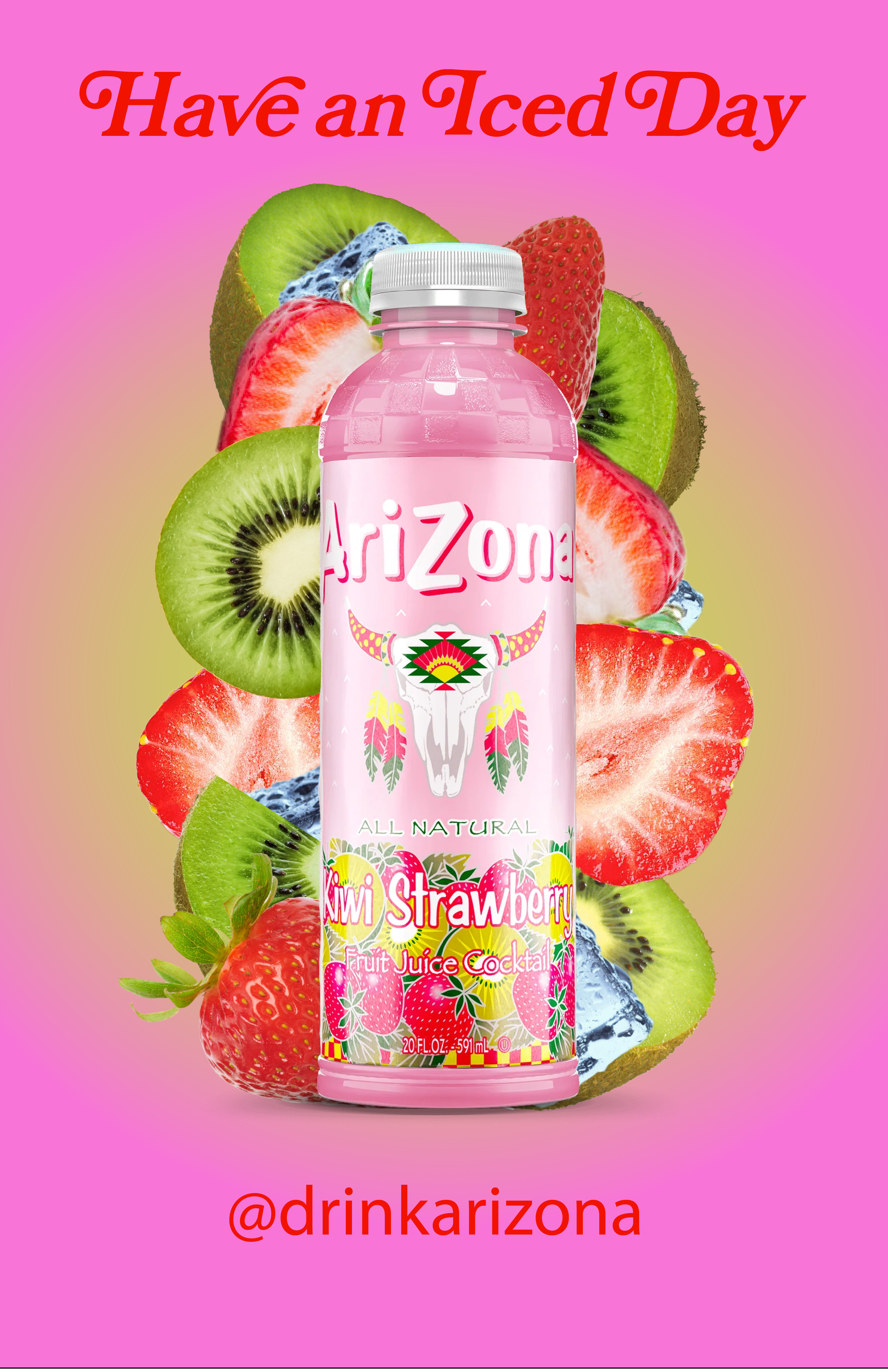
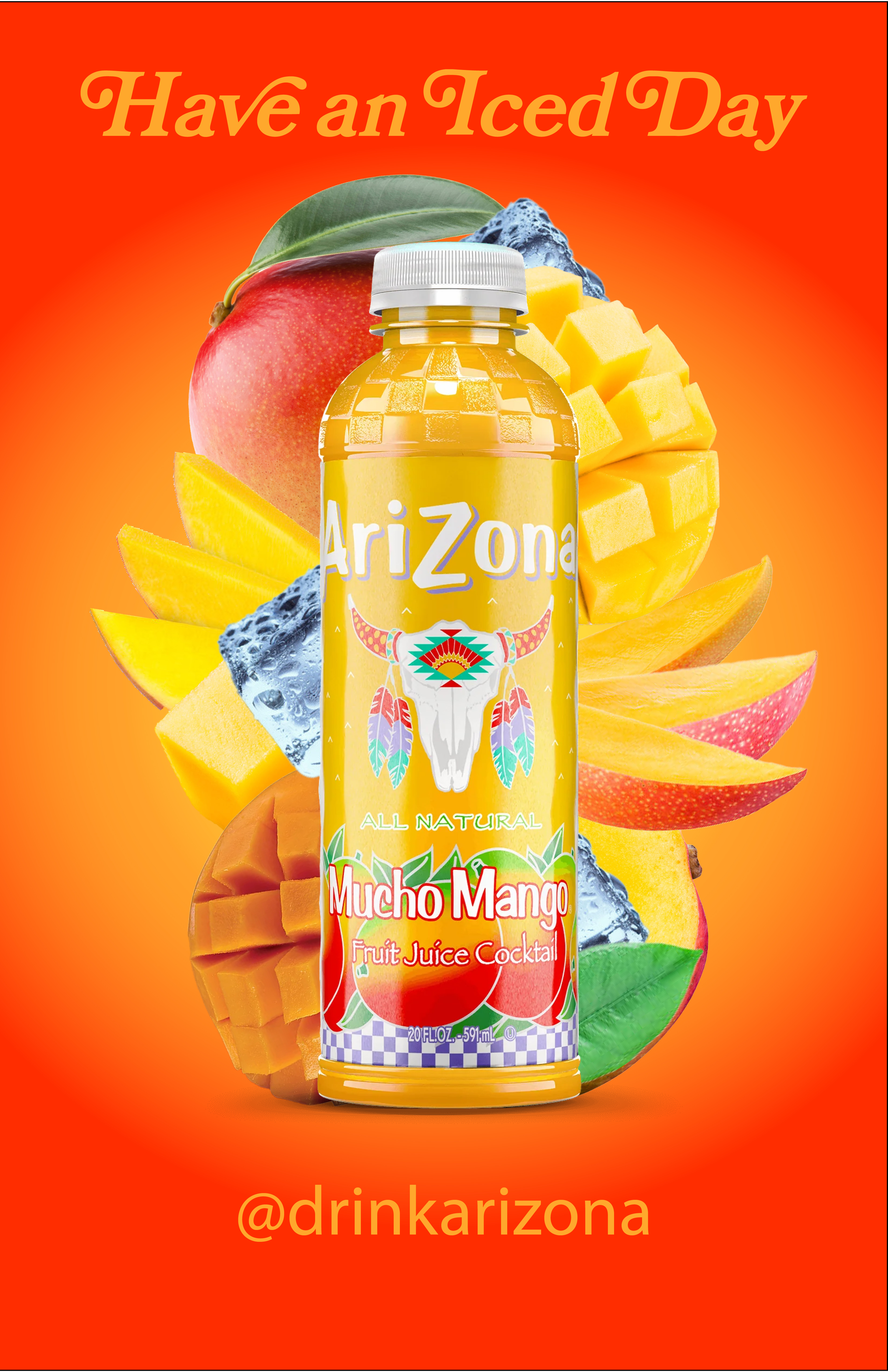
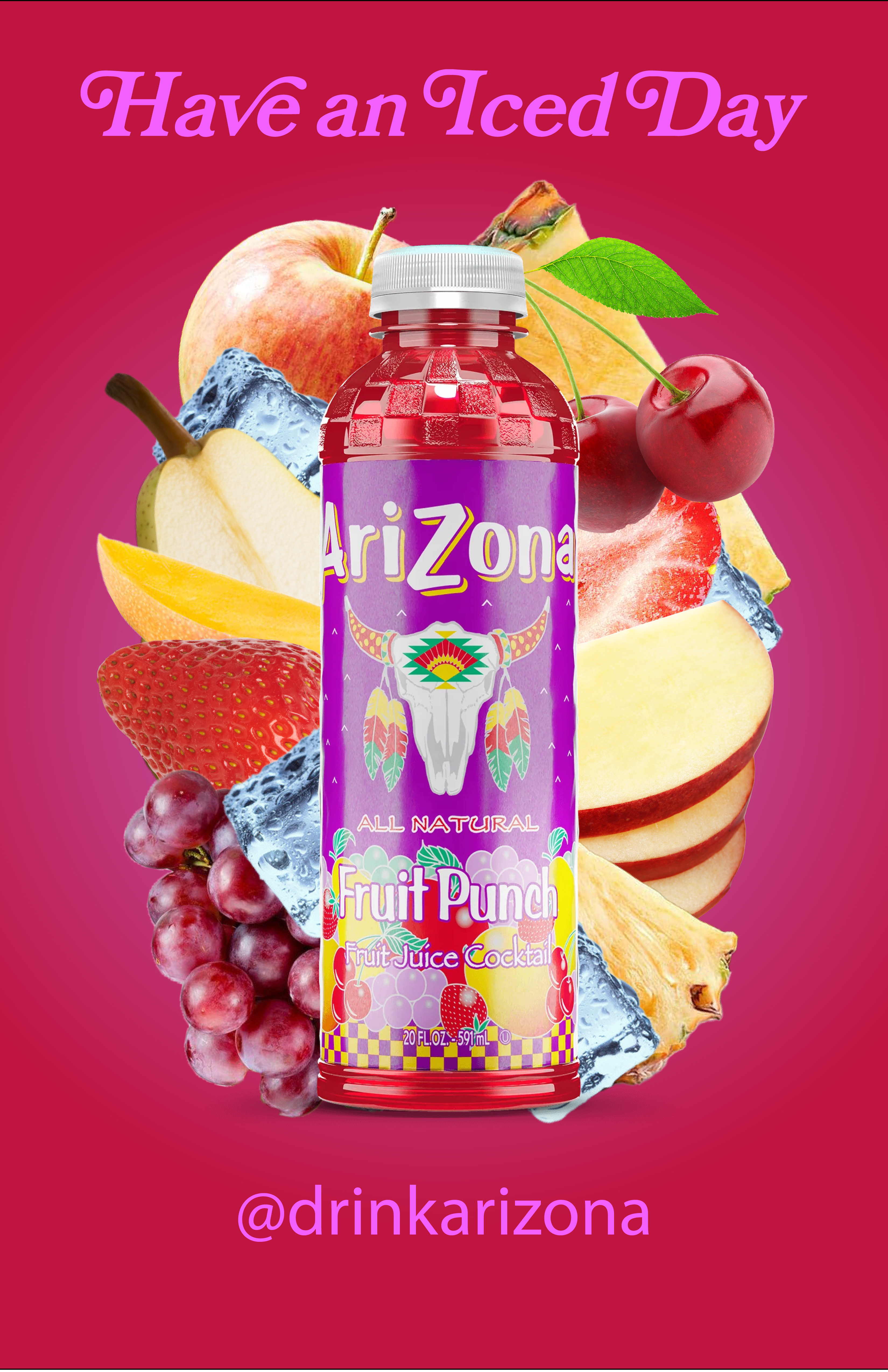
PROFILE/DESCRIPTION- The brand is AriZona Iced Tea. Its a large company that advertises its drinks (mainly tea and juice cocktails) mostly for teens and young adults. It tries to have a kind of “trendy” look with bright colors and designs. I am advertising their juices because they are less popular and I want to diversify the amount of products sold by them.
- I am advertising this in bus shelters around bay street Emeryville and downtown SF, because people tend to spend a lot of time there and generally walk a lot instead of driving, so they are more likely to stop and look. A large amount of younger people spend a lot of time in these areas aswell. The trendy vibes will also fit in well with the areas.
Brand Advantages:
- Trendy
- Colorful
- Eye-Catching
Brand Attributes:
- Popular
- Wide variety of flavors
Brand Experience:
- Refreshing drinks
I'm making a series of posters showcasing their popular juice cocktail flavors--Mucho Mango, Fruit Punch, and Kiwi Strawberry. I want the posters to have a plain-ish background with a gradient of the primary colors showcased on the bottles (For example, the Mucho Mango flavor is primarily red, orange, and yellow so the gradient will use those colors). In the middle, there will be the drink itself, and it will be surrounded with the fruits that are in it and semi-melted ice cubes, popping out at the viewer. On the top there will be their slogan “Have an Iced Day” and the AriZona logo will be on the bottom. I want my posters to pop out so that people stop to look, and so that people driving by can see the logo and @ for their social media to remind them. I don't think it necessarily needs to have much text because AriZona is recognizable as is, so this serves as more of a reminder than something meant to be people's first impressions of the company.