Albany High School Graphic Design
Student Showcase 2007-2022
Hall of Fame
HOF Assignments
HOF Projects
- A Problem To Solve
- Blend Tool Poster
- Book Covers
- Editorial Clipping Mask
- Editorial Graphic
- Flatten The Curve
- Focal Points
- InDesign Spread
- Pen Tablet Sketch
- Perf Film Windows — C106
- Photoshop Brush Face
- Product Flyer
- Product+Company Mashup
- Signs & Symbols
- Something is Back!
- Spec Ad—Poster
- T-shirts & Apparel
- Text-heavy Billboard
- The Perfect Color
- Thinking With Type
- Typeface Postcard
- Volleyball Poster
- Zachary’s Poster
- Things My Friends Say
- Journalism/Security Free Choice Assignment
Current-year Work
Current Assignments
Current Projects
- AHS Front Photoshop
- A Problem To Solve
- Blend Tool Poster
- Book Covers
- Brandmark Practice
- Editorial Clipping Mask
- Editorial Graphic
- Flatten The Curve
- Focal Points
- InDesign Spread
- Pen Tablet Sketch
- Perf Film Windows — C106
- Photoshop Brush Face
- Product Flyer
- Product+Company Mashup
- Signs & Symbols
- Something is Back!
- Spec Ad—Poster
- T-shirts & Apparel
- Text-heavy Billboard
- The Perfect Color
- Thinking With Type
- Typeface Postcard
- Zachary’s Poster
- Things My Friends Say
- Journalism/Security Free Choice Assignment


DESIGNER
Lucas Garcia-Lee
PROFILE/DESCRIPTION
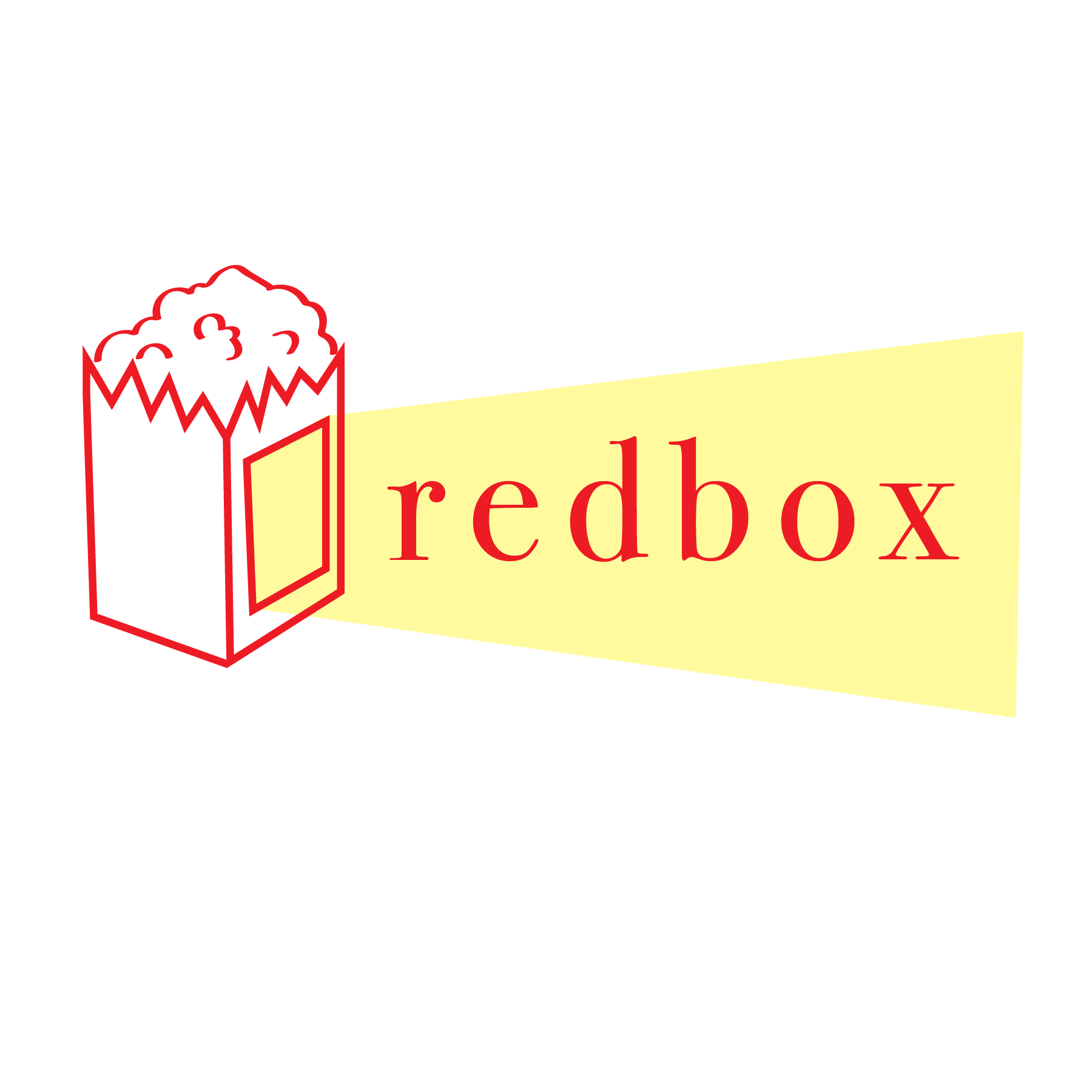
- For my company, I am re-envisioning the entertainment distribution brand Redbox.
- The new logo of Redbox is a lowercase serif font of the word ‘redbox’ with a period. The logo is too simple. It strikes me as harmless, with no feeling or personality. It’s not iconic, I think most people would have a hard time to remember it upon a glance. This exemplifies a key problem that Redbox has: it’s not memorable.
- My new logo will be the text of Redbox and an icon, which can also be modified into a mascot. The mascot will be more unique than the previous logos and will make the brand more memorable and give it character. It will also add consistency as on Redbox’s website, there seems to be symbol with the logo, but it doesn’t appear on other products. So sometimes the logo has this add on and sometimes it doesn’t.
- The mascot will be an anthropometric bag of popcorn, with simplified arms and legs. They will have a tv screen for a face, with a simplistic smiley face. The color scheme will be red and white, and they will be named Rufus. I think the design works because the icons of popcorn and screens connect to watching movies.
- Due to the sleek and minimal aesthetic of many streaming services, along with Redbox’s previous blandness, this new Redbox will differentiate more. For example, the red boxes could be redesigned a bit more like ticket booths. The kiosks are already a novelty by themselves, so using the aesthetic of a ticket booth could make using the machine more of an experience. You could integrate the mascot into the selection screen as a kind of guide and have it make witty responses or something to give the brand more personality.
- Profile:
- The business model will be the same as before. There will be physical kiosks (the titular red boxes) with touch screens to buy, rent, and preorder movies for those who want to have a convenient place for physical media, as DVD stores are scarce. The website will stay up to appeal to the boom of streaming services, where one can watch and rent movies online. It will be a brand that operates within the U.S.
- Redbox was previously bland, so the new company should feel more unique and have more personality.
- To create more personality and to improve the brand’s reputation, the mascot could be goofy or silly.
- Since the business is hands-on (with the kiosks) the design should be friendly and approachable but sturdy.
- Friendly without trying to target a very specific audience (for general movie-goers)
- The business started off unorthodox with the kiosks, so try to keep a feeling of being a bit strange, but still have the feeling of something that is more-or-less family-friendly. Don’t want to be too dull like old Redbox but not off-puttingly weird.
- Redbox is not an extravagant business, so it should feel like it knows its limits if that makes sense.