Albany High School Graphic Design
Student Showcase 2007-2022
- A Problem To Solve
- Blend Tool Poster
- Book Covers
- Editorial Clipping Mask
- Editorial Graphic
- Flatten The Curve
- Focal Points
- InDesign Spread
- Pen Tablet Sketch
- Perf Film Windows — C106
- Photoshop Brush Face
- Product Flyer
- Product+Company Mashup
- Signs & Symbols
- Something is Back!
- Spec Ad—Poster
- T-shirts & Apparel
- Text-heavy Billboard
- The Perfect Color
- Thinking With Type
- Typeface Postcard
- Volleyball Poster
- Zachary’s Poster
- Things My Friends Say
- Journalism/Security Free Choice Assignment
- AHS Front Photoshop
- A Problem To Solve
- Blend Tool Poster
- Book Covers
- Brandmark Practice
- Editorial Clipping Mask
- Editorial Graphic
- Flatten The Curve
- Focal Points
- InDesign Spread
- Pen Tablet Sketch
- Perf Film Windows — C106
- Photoshop Brush Face
- Product Flyer
- Product+Company Mashup
- Signs & Symbols
- Something is Back!
- Spec Ad—Poster
- T-shirts & Apparel
- Text-heavy Billboard
- The Perfect Color
- Thinking With Type
- Typeface Postcard
- Zachary’s Poster
- Things My Friends Say
- Journalism/Security Free Choice Assignment

Charlie Bliss
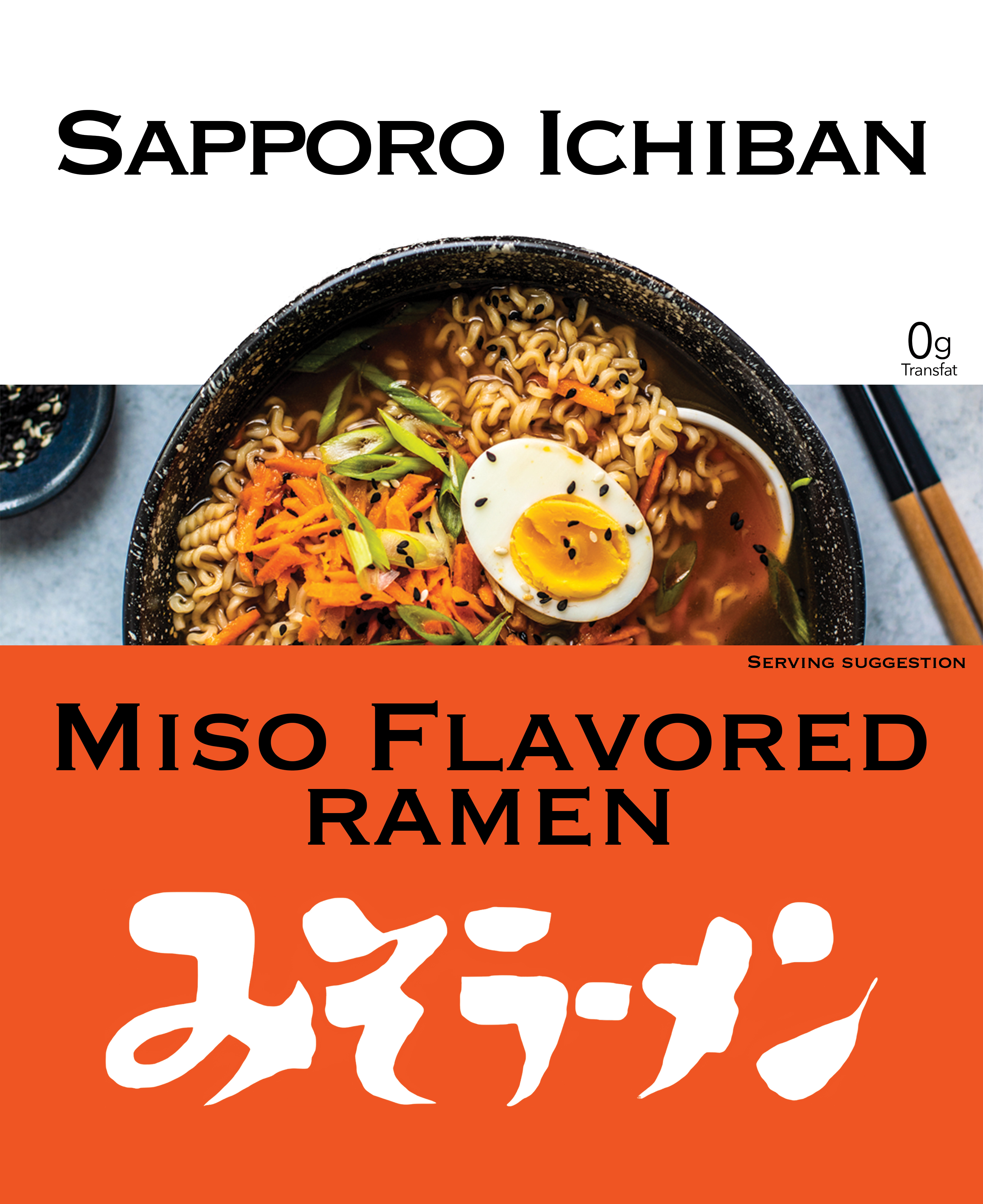
PROFILE/DESCRIPTIONSapporo Ichiban ramen is an instant ramen brand. The product is seen as a more a premium product than other instant ramen, while keeping a very reasonable price. It is currently being sold in Target, Walmart, 99 ranch and many other stores in America.
GOALSMy design will be more minimalistic to seem more healthy, modern, and premium. It should also stand out from other ramen packaging, that are typically very busy, by being more organized. It will also include a very prominent picture of the food in the middle of the packaging to entice people and make it look more appetizing.
Another important thing is to maintain key elements like the name, logo, and colors because the product is already quite popular so people who are already buying it should be able to recognize it as the same product.
PRIORITIES- The first thing seen should be the picture of ramen
- Next they should read Miso flavored Ramen
- Then they should see the logo at the bottom
- Next they should see Sapporo Ichiban at the top of the package
- Finally, they should see the little text like “serving suggestion” and 0g transfats
the target audience for my redesign is 14 - 24 year olds. I chose this audience because I believe they already eat the most ramen, but I think that Sapporo Ichiban could take a larger share of this market with a design that stands out from the many other brands.
BRAND CHARACTERThe brand is already popular and seen as a ramen option that is a little bit better for a little bit more money.
COMPETITIVE SITUATIONThere are a lot of competitors, but the largest ones are probably top ramen and Cup Noodles. Cup noodles is easier to prepare, but seems less healthy because of the styrofoam cup and brightly colored flavor packet. Top ramen similarly seems less healthy because of bright flavor powder, but top ramen is cheaper, so Sapporo Ichiban ramen will have to seem more premium.