Albany High School Graphic Design
Student Showcase 2007-2022
- A Problem To Solve
- Blend Tool Poster
- Book Covers
- Editorial Clipping Mask
- Editorial Graphic
- Flatten The Curve
- Focal Points
- InDesign Spread
- Pen Tablet Sketch
- Perf Film Windows — C106
- Photoshop Brush Face
- Product Flyer
- Product+Company Mashup
- Signs & Symbols
- Something is Back!
- Spec Ad—Poster
- T-shirts & Apparel
- Text-heavy Billboard
- The Perfect Color
- Thinking With Type
- Typeface Postcard
- Volleyball Poster
- Zachary’s Poster
- Things My Friends Say
- Journalism/Security Free Choice Assignment
- AHS Front Photoshop
- A Problem To Solve
- Blend Tool Poster
- Book Covers
- Brandmark Practice
- Editorial Clipping Mask
- Editorial Graphic
- Flatten The Curve
- Focal Points
- InDesign Spread
- Pen Tablet Sketch
- Perf Film Windows — C106
- Photoshop Brush Face
- Product Flyer
- Product+Company Mashup
- Signs & Symbols
- Something is Back!
- Spec Ad—Poster
- T-shirts & Apparel
- Text-heavy Billboard
- The Perfect Color
- Thinking With Type
- Typeface Postcard
- Zachary’s Poster
- Things My Friends Say
- Journalism/Security Free Choice Assignment
David Kim
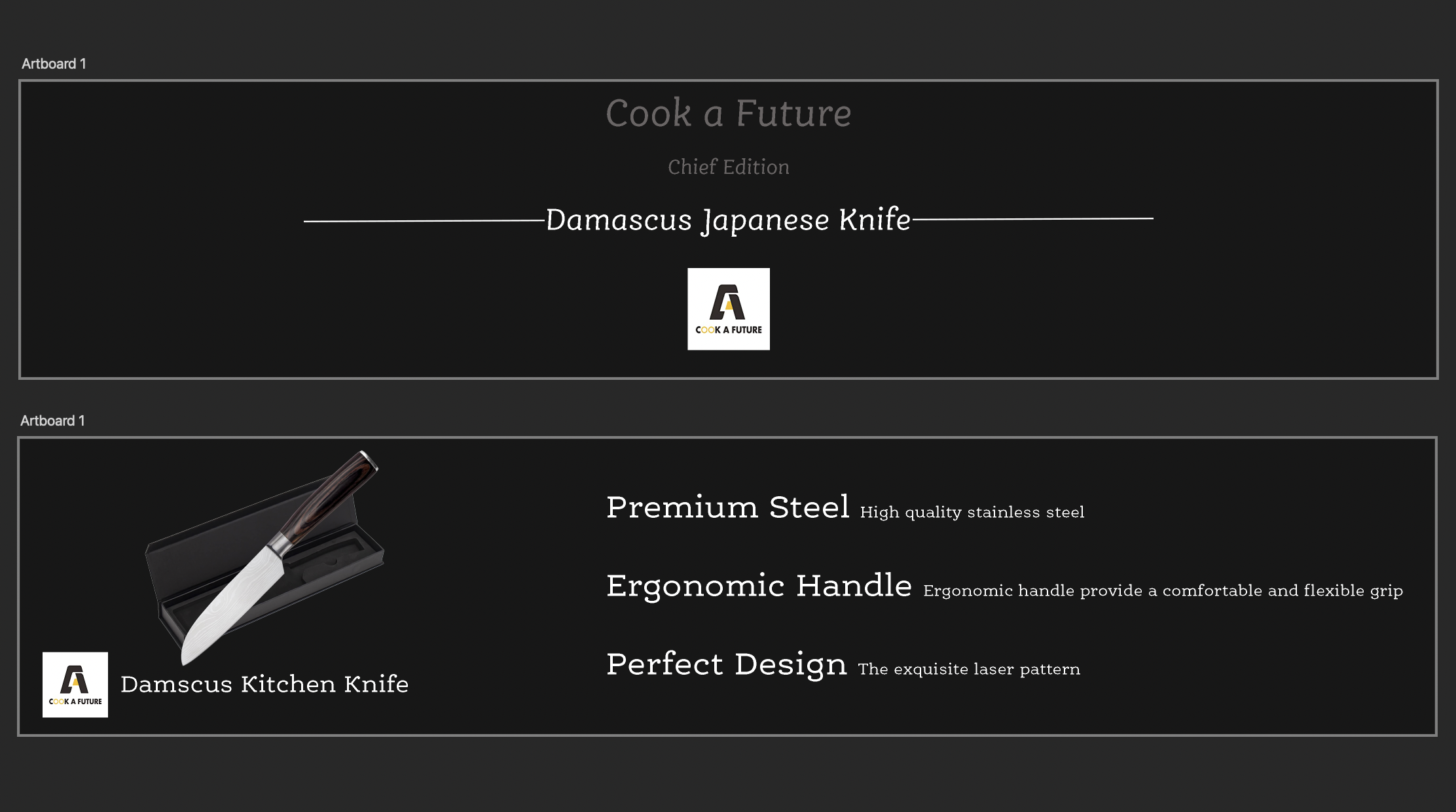
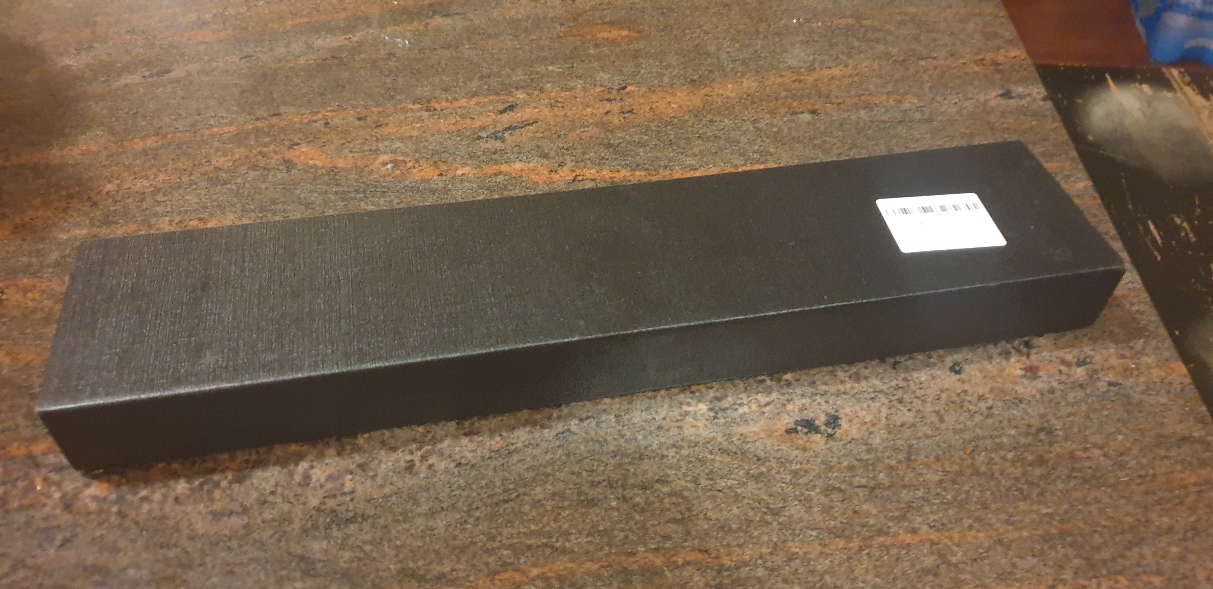
PROFILE/DESCRIPTIONThe package that I am going to redesign is a package of a knife and my dad bought it from amazon. It is true that it is not a very expensive knife but the only thing that is on the package is the barcode which is also a sticker. I just think that it seems like a very cheap $15 Daiso knife because there is only a sticker in the box. So I just think that there must be a logo in the front of the box(the sticker side) and a brief product description(the inside of the box).
GOALSThe main goal is to change the package to seem like it is not a cheap knife but more expensive and classy.
PRIORITIESThe priorities is making the package more “expensive." The main communication that we should make is that this product is a classy and a expensive one. So, we should make the fonts and coloring more “expensive."
- Logo of the company
- Brief product description / benefits (inside)
- Image of a knife (inside)
- Expensive ambience
The target audience is everyone that will buy the knife but also, target audience could be the people around the person who bought the knife because they will also look at the knife just like me and could say “few words” about the knife.
BRAND CHARACTERThere is no specific Brand Character. But there are brief descriptions of the product.
- Premium Steel
- Ergonomic Handle
- Perfect Design
The competitive situation is all other knives but the knife that I am redesigning is in the middle of cheap and expensive knives and if we make the packaging better than other same-priced products, we can develop product competitiveness compared to others.