Albany High School Graphic Design
Student Showcase 2007-2022
- A Problem To Solve
- Blend Tool Poster
- Book Covers
- Editorial Clipping Mask
- Editorial Graphic
- Flatten The Curve
- Focal Points
- InDesign Spread
- Pen Tablet Sketch
- Perf Film Windows — C106
- Photoshop Brush Face
- Product Flyer
- Product+Company Mashup
- Signs & Symbols
- Something is Back!
- Spec Ad—Poster
- T-shirts & Apparel
- Text-heavy Billboard
- The Perfect Color
- Thinking With Type
- Typeface Postcard
- Volleyball Poster
- Zachary’s Poster
- Things My Friends Say
- Journalism/Security Free Choice Assignment
- AHS Front Photoshop
- A Problem To Solve
- Blend Tool Poster
- Book Covers
- Brandmark Practice
- Editorial Clipping Mask
- Editorial Graphic
- Flatten The Curve
- Focal Points
- InDesign Spread
- Pen Tablet Sketch
- Perf Film Windows — C106
- Photoshop Brush Face
- Product Flyer
- Product+Company Mashup
- Signs & Symbols
- Something is Back!
- Spec Ad—Poster
- T-shirts & Apparel
- Text-heavy Billboard
- The Perfect Color
- Thinking With Type
- Typeface Postcard
- Zachary’s Poster
- Things My Friends Say
- Journalism/Security Free Choice Assignment

Portia Abbott
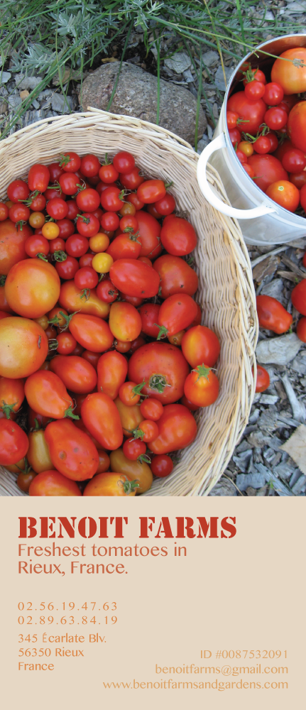
PROFILE/DESCRIPTIONFor the project, we created a flier for a company of our choice, following Before and After #671 as a guide. My company in particular is a fictional one from a book, where all I know about it is the name of the farm and a little bit about how it runs. Everything else is made up, but I did search up how to write a proper address and phone number in France, and the ID numbers fits in with the book's setting. Also, in this book, it's in a future where they speak mainly English in France, so this is why all of it is in English except for the street.
GOALSSince I was creating something for a farm, I used the stenciled font face to model the bold labels thought to be sprayed onto farm boxes. As for the font color, when people think of tomatoes, the juicy red tomato remains the most iconic. Because of this, I used a picture with mainly red tomatoes, and picked up a red for the largest text on the flier. To make the eye flow from top to bottom, I chose lighter colors and lowered font size as I went down, modeling the slight oranges and yellows on a few of the tomatoes. When there was not enough room on the right side for well spaced text, I moved some over to the other side, paying attention to the way it complimented the other text and working with it until I thought it created an interesting diagonal line with the negative space. The reason I chose this image in particular, besides the red tomatoes, is because Benoit Farms is a small family farm and the basket and small metal bucket give the impression of handpicked, personal tomato growing.