Albany High School Graphic Design
Student Showcase 2007-2022
Hall of Fame
HOF Assignments
HOF Projects
- A Problem To Solve
- Blend Tool Poster
- Book Covers
- Editorial Clipping Mask
- Editorial Graphic
- Flatten The Curve
- Focal Points
- InDesign Spread
- Pen Tablet Sketch
- Perf Film Windows — C106
- Photoshop Brush Face
- Product Flyer
- Product+Company Mashup
- Signs & Symbols
- Something is Back!
- Spec Ad—Poster
- T-shirts & Apparel
- Text-heavy Billboard
- The Perfect Color
- Thinking With Type
- Typeface Postcard
- Volleyball Poster
- Zachary’s Poster
- Things My Friends Say
- Journalism/Security Free Choice Assignment
Current-year Work
Current Assignments
Current Projects
- AHS Front Photoshop
- A Problem To Solve
- Blend Tool Poster
- Book Covers
- Brandmark Practice
- Editorial Clipping Mask
- Editorial Graphic
- Flatten The Curve
- Focal Points
- InDesign Spread
- Pen Tablet Sketch
- Perf Film Windows — C106
- Photoshop Brush Face
- Product Flyer
- Product+Company Mashup
- Signs & Symbols
- Something is Back!
- Spec Ad—Poster
- T-shirts & Apparel
- Text-heavy Billboard
- The Perfect Color
- Thinking With Type
- Typeface Postcard
- Zachary’s Poster
- Things My Friends Say
- Journalism/Security Free Choice Assignment

DESIGNER
Genevieve & Gloria
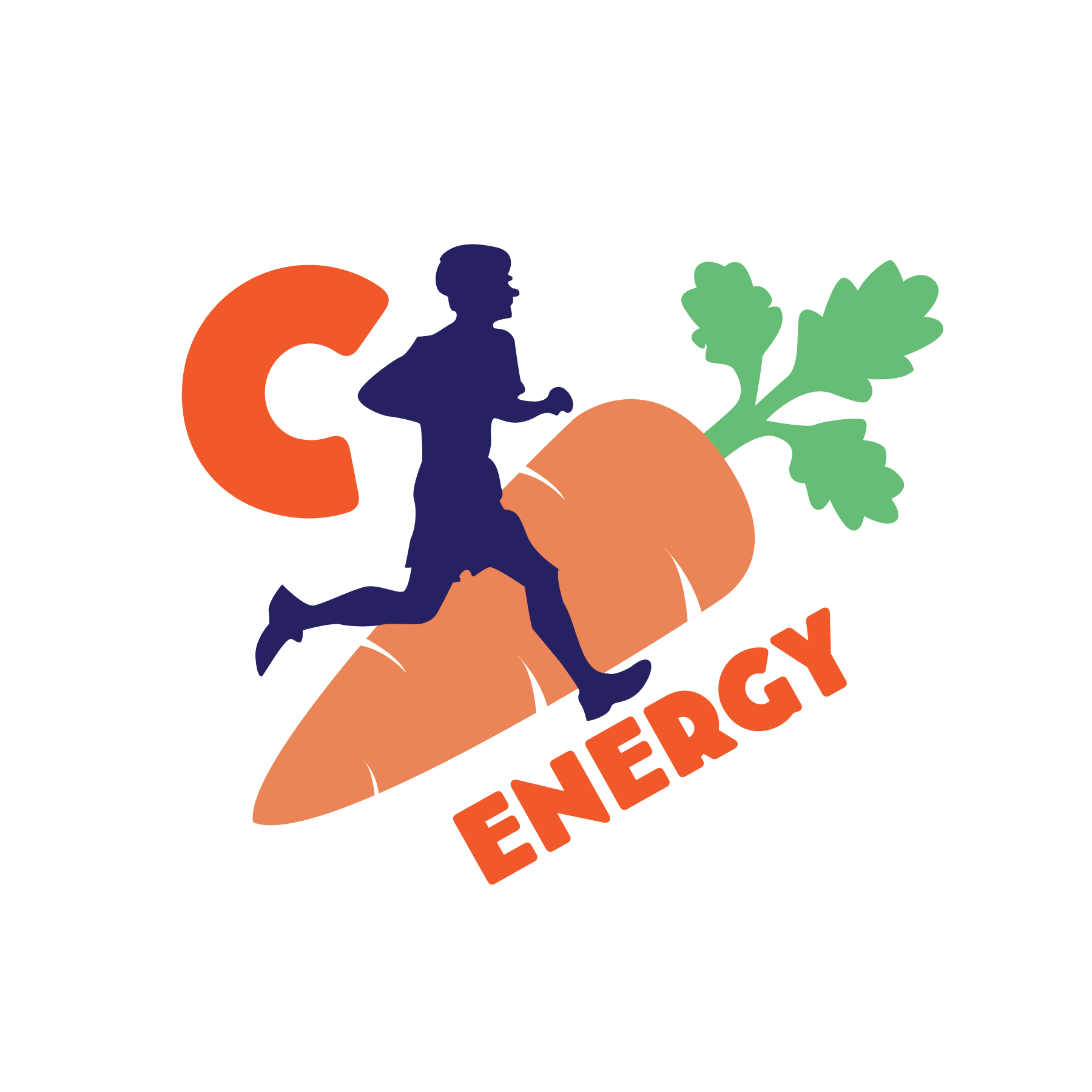
PROFILE/DESCRIPTIONWhen we took a look at the original design, we thought it was too intense. That's why we chose a round font to make it more fun and geared towards teenagers! The C is supposed to have a double meaning - Vitamin C, and Carrot (also ‘carrot’ is kind of unappetizing). The original logo had an old man running so we changed it to a teenage boy. Finally, we enlarged the carrot because it is an important part of the new drink.