Albany High School Graphic Design
Student Showcase 2007-2022
Hall of Fame
HOF Assignments
HOF Projects
- A Problem To Solve
- Blend Tool Poster
- Book Covers
- Editorial Clipping Mask
- Editorial Graphic
- Flatten The Curve
- Focal Points
- Pen Tablet Sketch
- Perf Film Windows
- Photoshop Brush Face
- Product Flyer
- Product+Company Mashup
- Signs & Symbols
- Something is Back!
- Spec Ad—Poster
- T-shirts & Apparel
- Text-heavy Billboard
- The Perfect Color
- Thinking With Type
- Typeface Postcard
- Volleyball Poster
- Zachary’s Poster
- Things My Friends Say
- Journalism/Security Free Choice Assignment
Current-year Work
Current Assignments
Current Projects
- AHS Front Photoshop
- A Problem To Solve
- Blend Tool Poster
- Book Covers
- Brandmark Practice
- Editorial Clipping Mask
- Editorial Graphic
- Flatten The Curve
- Focal Points
- Pen Tablet Sketch
- Perf Film Windows
- Photoshop Brush Face
- Product Flyer
- Product+Company Mashup
- Signs & Symbols
- Something is Back!
- Spec Ad—Poster
- T-shirts & Apparel
- Text-heavy Billboard
- The Perfect Color
- Thinking With Type
- Typeface Postcard
- Zachary’s Poster
- Things My Friends Say
- Journalism/Security Free Choice Assignment

DESIGNER
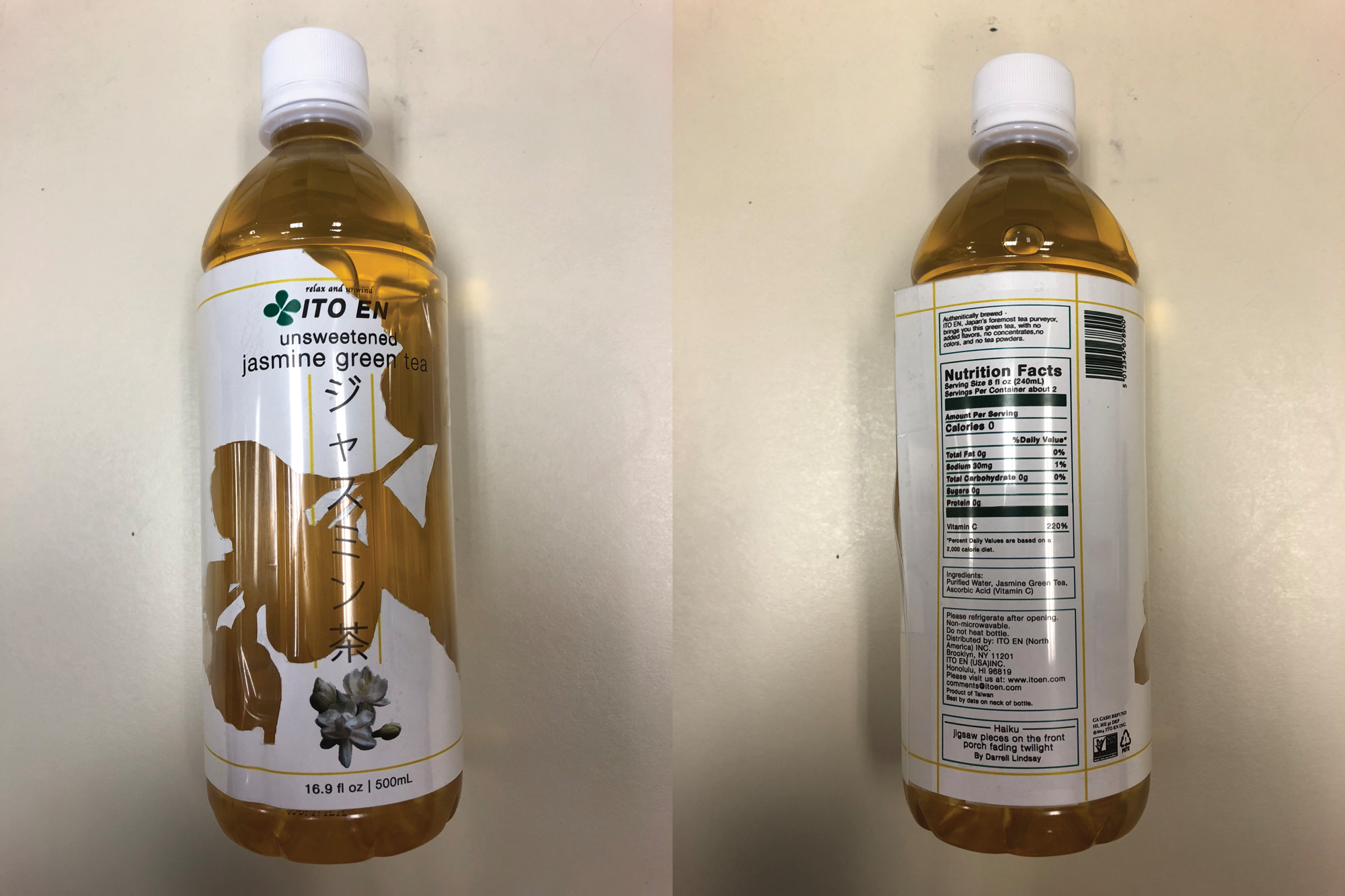
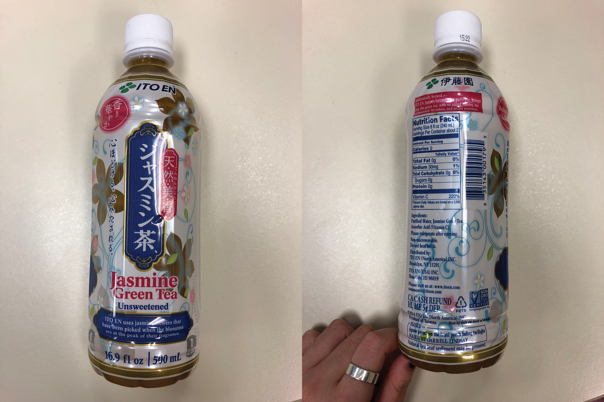
Alyssa Ha
PROFILE/DESCRIPTIONUpdate current ITO EN Jasmine Green Tea bottle to a more modern, not so crowded packaging. This includes:
- Using similar colors from the orignal bottle
- Using the same text provided
- Updating the design as a whole
- Creating a design that interrupts the shopper to purchase and then keep buying
- Maintain ITO EN aesthetics for consistency yet have a more modern look
- Represent the authenticity of the tea
- branding ITO EN
- Japanese lettering
- product name/ type of tea and unsweetened
- adjectives about tea (refreshing, aromatic, relax and unwind)
- describing the tea (how they make the tea, authentically brewed)
- Everyone
- tea lovers/ people who want to choose to drink something soothing
- 40% in 15-25 year age group
- 60 % in 26 year or older age group
ITO-EN has this product labeled as their "traditional" teas. Statements that correspond with their Jasmine Tea specifically:
- Refreshing and Aromatic
- Relax and Unwind
- How they make the tea
For the majority of their teas:
- Unsweetened
- The tea type
- Lipton- been around for a long time, American brand
- Gold Peak- hipster, "made in the mountains", American brand
- Arizona- been around for a long time, super sweet—appeals to younger people, American brand
- Honest tea- clear, refreshing, straight to the point
- Tazo- modern tea