Albany High School Graphic Design
Student Showcase 2007-2022
- A Problem To Solve
- Blend Tool Poster
- Book Covers
- Editorial Clipping Mask
- Editorial Graphic
- Flatten The Curve
- Focal Points
- InDesign Spread
- Pen Tablet Sketch
- Perf Film Windows — C106
- Photoshop Brush Face
- Product Flyer
- Product+Company Mashup
- Signs & Symbols
- Something is Back!
- Spec Ad—Poster
- T-shirts & Apparel
- Text-heavy Billboard
- The Perfect Color
- Thinking With Type
- Typeface Postcard
- Volleyball Poster
- Zachary’s Poster
- Things My Friends Say
- Journalism/Security Free Choice Assignment
- AHS Front Photoshop
- A Problem To Solve
- Blend Tool Poster
- Book Covers
- Brandmark Practice
- Editorial Clipping Mask
- Editorial Graphic
- Flatten The Curve
- Focal Points
- InDesign Spread
- Pen Tablet Sketch
- Perf Film Windows — C106
- Photoshop Brush Face
- Product Flyer
- Product+Company Mashup
- Signs & Symbols
- Something is Back!
- Spec Ad—Poster
- T-shirts & Apparel
- Text-heavy Billboard
- The Perfect Color
- Thinking With Type
- Typeface Postcard
- Zachary’s Poster
- Things My Friends Say
- Journalism/Security Free Choice Assignment

Quynh Tran
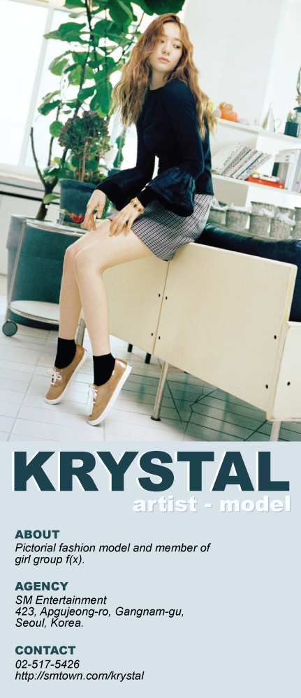
PROFILE/DESCRIPTIONThis project is a continuation of the practice of the use of typography in the form of a product flyer. The main model for this project is Krystal Jung, an artist and model under her agency of SM Entertainment. Her image is that of a mature young woman, with a mix of both the aesthetic fashion of the matured audience but also a sense of youth.
GOALSKrystal Jung have the image of a mature young girl, so it was fitting for a more earthly color palette to be used along with the use of the font Arial, both regular and bolded. Arial can be a really common theme, but the use of it for this specific model really brings out a sense of maturity with the bolded but not too flashy font. The colors are picked from the image to create a sense of harmony between the text and the image, to draw the attention to not only the image but also the text underneath. The description of About, Agency, and Contact are all italicized because having text only regular and bolded can be come rather boring so italicizing the words bring a more "fun" element to the flyer though not flashy enough to break the maturity theme of the flyer.