Albany High School Graphic Design
Student Showcase 2007-2022
Hall of Fame
HOF Assignments
HOF Projects
- A Problem To Solve
- Blend Tool Poster
- Book Covers
- Editorial Clipping Mask
- Editorial Graphic
- Flatten The Curve
- Focal Points
- InDesign Spread
- Pen Tablet Sketch
- Perf Film Windows — C106
- Photoshop Brush Face
- Product Flyer
- Product+Company Mashup
- Signs & Symbols
- Something is Back!
- Spec Ad—Poster
- T-shirts & Apparel
- Text-heavy Billboard
- The Perfect Color
- Thinking With Type
- Typeface Postcard
- Volleyball Poster
- Zachary’s Poster
- Things My Friends Say
- Journalism/Security Free Choice Assignment
Current-year Work
Current Assignments
Current Projects
- AHS Front Photoshop
- A Problem To Solve
- Blend Tool Poster
- Book Covers
- Brandmark Practice
- Editorial Clipping Mask
- Editorial Graphic
- Flatten The Curve
- Focal Points
- InDesign Spread
- Pen Tablet Sketch
- Perf Film Windows — C106
- Photoshop Brush Face
- Product Flyer
- Product+Company Mashup
- Signs & Symbols
- Something is Back!
- Spec Ad—Poster
- T-shirts & Apparel
- Text-heavy Billboard
- The Perfect Color
- Thinking With Type
- Typeface Postcard
- Zachary’s Poster
- Things My Friends Say
- Journalism/Security Free Choice Assignment

DESIGNER
Yan Jimmy jimmyy71996
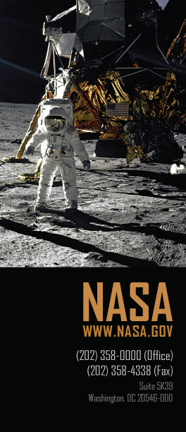
PROFILE/DESCRIPTIONIn order to match the feeling of the moon landing I had to choose a font that was not serif. I also felt that this font could not be too curvy which removed fonts like Arial and Helvetica because of the “S.” The orange used on “NASA” was my attempt in matching the color found on the wrapping on their spacecraft. The phone numbers are next which I tried to make the color of the ground. The address is not important so I made it a dark gray to blend it in with the background.