Albany High School Graphic Design
Student Showcase 2007-2022
- A Problem To Solve
- Blend Tool Poster
- Book Covers
- Editorial Clipping Mask
- Editorial Graphic
- Flatten The Curve
- Focal Points
- InDesign Spread
- Pen Tablet Sketch
- Perf Film Windows — C106
- Photoshop Brush Face
- Product Flyer
- Product+Company Mashup
- Signs & Symbols
- Something is Back!
- Spec Ad—Poster
- T-shirts & Apparel
- Text-heavy Billboard
- The Perfect Color
- Thinking With Type
- Typeface Postcard
- Volleyball Poster
- Zachary’s Poster
- Things My Friends Say
- Journalism/Security Free Choice Assignment
- AHS Front Photoshop
- A Problem To Solve
- Blend Tool Poster
- Book Covers
- Brandmark Practice
- Editorial Clipping Mask
- Editorial Graphic
- Flatten The Curve
- Focal Points
- InDesign Spread
- Pen Tablet Sketch
- Perf Film Windows — C106
- Photoshop Brush Face
- Product Flyer
- Product+Company Mashup
- Signs & Symbols
- Something is Back!
- Spec Ad—Poster
- T-shirts & Apparel
- Text-heavy Billboard
- The Perfect Color
- Thinking With Type
- Typeface Postcard
- Zachary’s Poster
- Things My Friends Say
- Journalism/Security Free Choice Assignment
Jonah Fisher
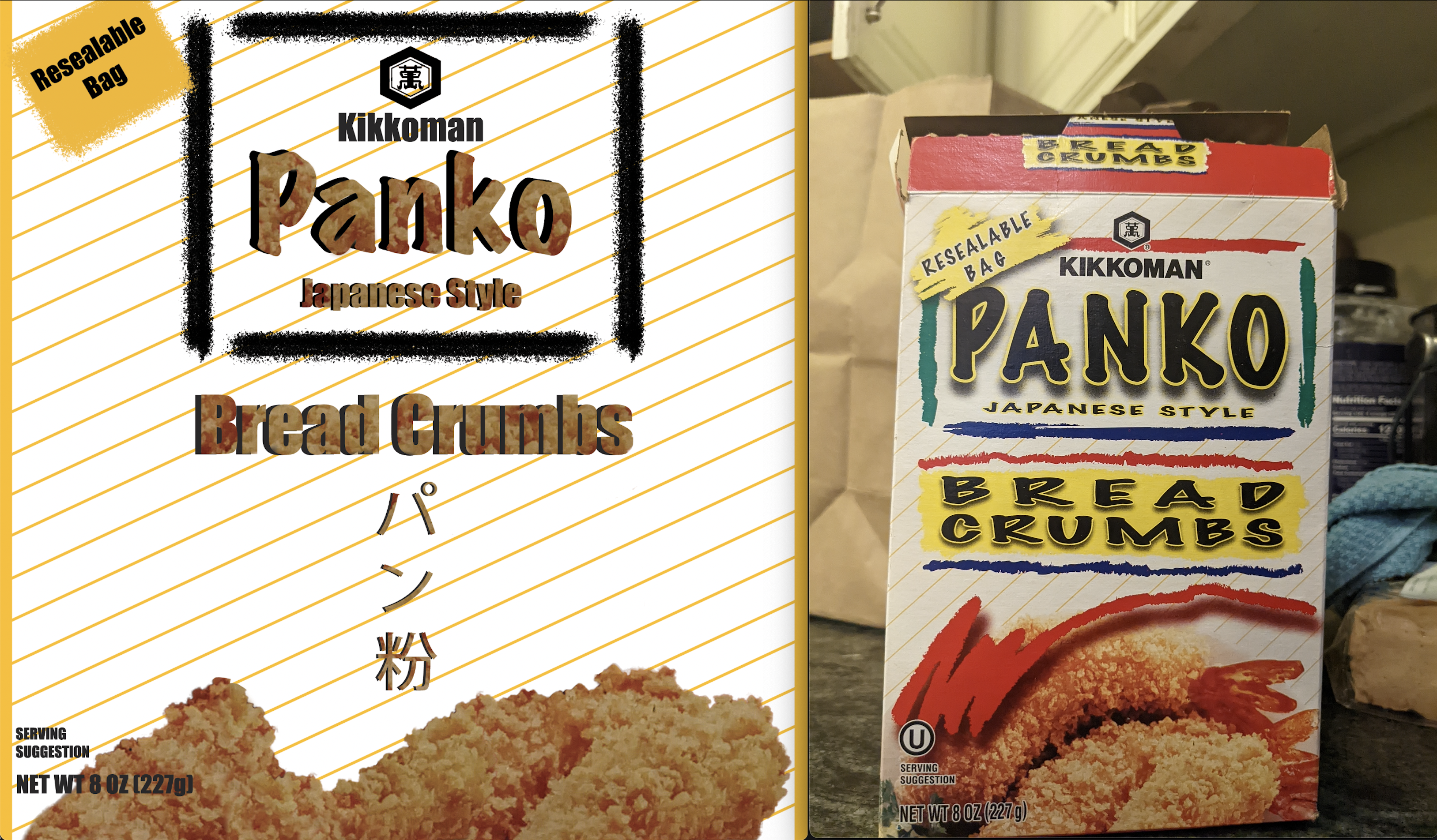
PROFILE/DESCRIPTIONThe purpose of this redesign is to make the box more appealing towards middle aged dads. I want to redesign the box using colors appropriate towards the box, not just ones scribbled on. Kikkoman is a large Japanese company, located in Walworth, Wisconsin. They have many factories around the world. Kikkoman has been around since 1917. They hired me to redesign their old outdating 80's style box to turn it into a modern type of box that will appeal to middle aged adults. These boxes are mainly designed to be in a regular retail store, not specifically for a high-end store.
GOALSTo make the Kikkoman Panko Bread Crumbs box more appealing to try to get more people to buy them, specifically middle aged adults
PRIORITIES- Branding: Kikkoman
- Product name: Panko Bread Crumbs
- Tasty, Crunchy, Can go with your cooking
- Image: The chicken of the bottom covered with Bread Crumbs
Preferably middle aged adults, in a regular retail market
BRAND CHARACTERTasty
Reliable
Connected to it's roots
Something that makes food better
COMPETITIVE SITUATIONLike many companies, Kikkoman is trying to sell as many Panko bread crumbs boxes as they can. They want their Bread Cumb boxes to look better so they can sell more than other companies
Their competition is Progresso™ Plain Bread Crumbs, and Aleia's Gluten Free Italian Bread Crumbs