Albany High School Graphic Design
Student Showcase 2007-2022
- A Problem To Solve
- Blend Tool Poster
- Book Covers
- Editorial Clipping Mask
- Editorial Graphic
- Flatten The Curve
- Focal Points
- InDesign Spread
- Pen Tablet Sketch
- Perf Film Windows — C106
- Photoshop Brush Face
- Product Flyer
- Product+Company Mashup
- Signs & Symbols
- Something is Back!
- Spec Ad—Poster
- T-shirts & Apparel
- Text-heavy Billboard
- The Perfect Color
- Thinking With Type
- Typeface Postcard
- Volleyball Poster
- Zachary’s Poster
- Things My Friends Say
- Journalism/Security Free Choice Assignment
- AHS Front Photoshop
- A Problem To Solve
- Blend Tool Poster
- Book Covers
- Brandmark Practice
- Editorial Clipping Mask
- Editorial Graphic
- Flatten The Curve
- Focal Points
- InDesign Spread
- Pen Tablet Sketch
- Perf Film Windows — C106
- Photoshop Brush Face
- Product Flyer
- Product+Company Mashup
- Signs & Symbols
- Something is Back!
- Spec Ad—Poster
- T-shirts & Apparel
- Text-heavy Billboard
- The Perfect Color
- Thinking With Type
- Typeface Postcard
- Zachary’s Poster
- Things My Friends Say
- Journalism/Security Free Choice Assignment
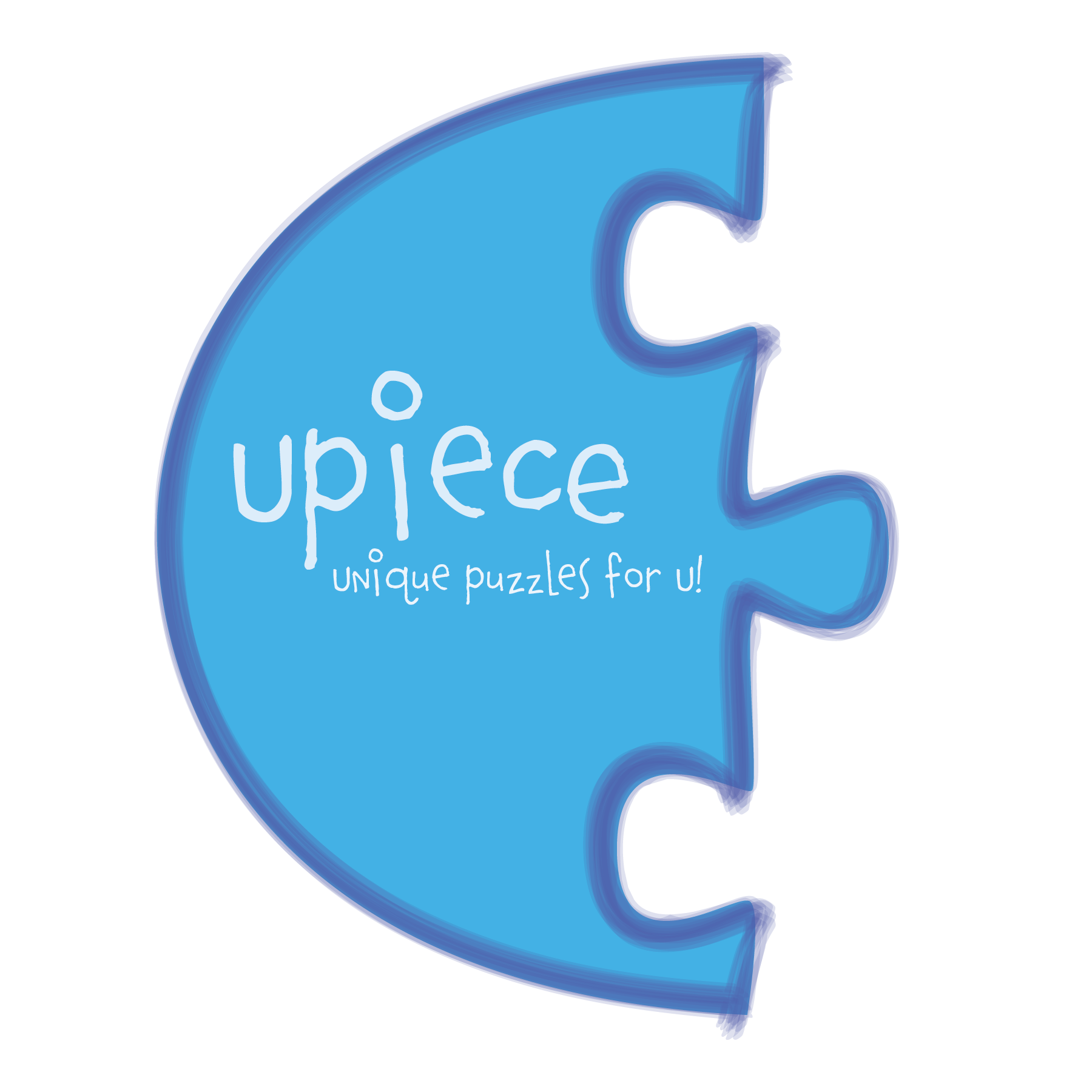
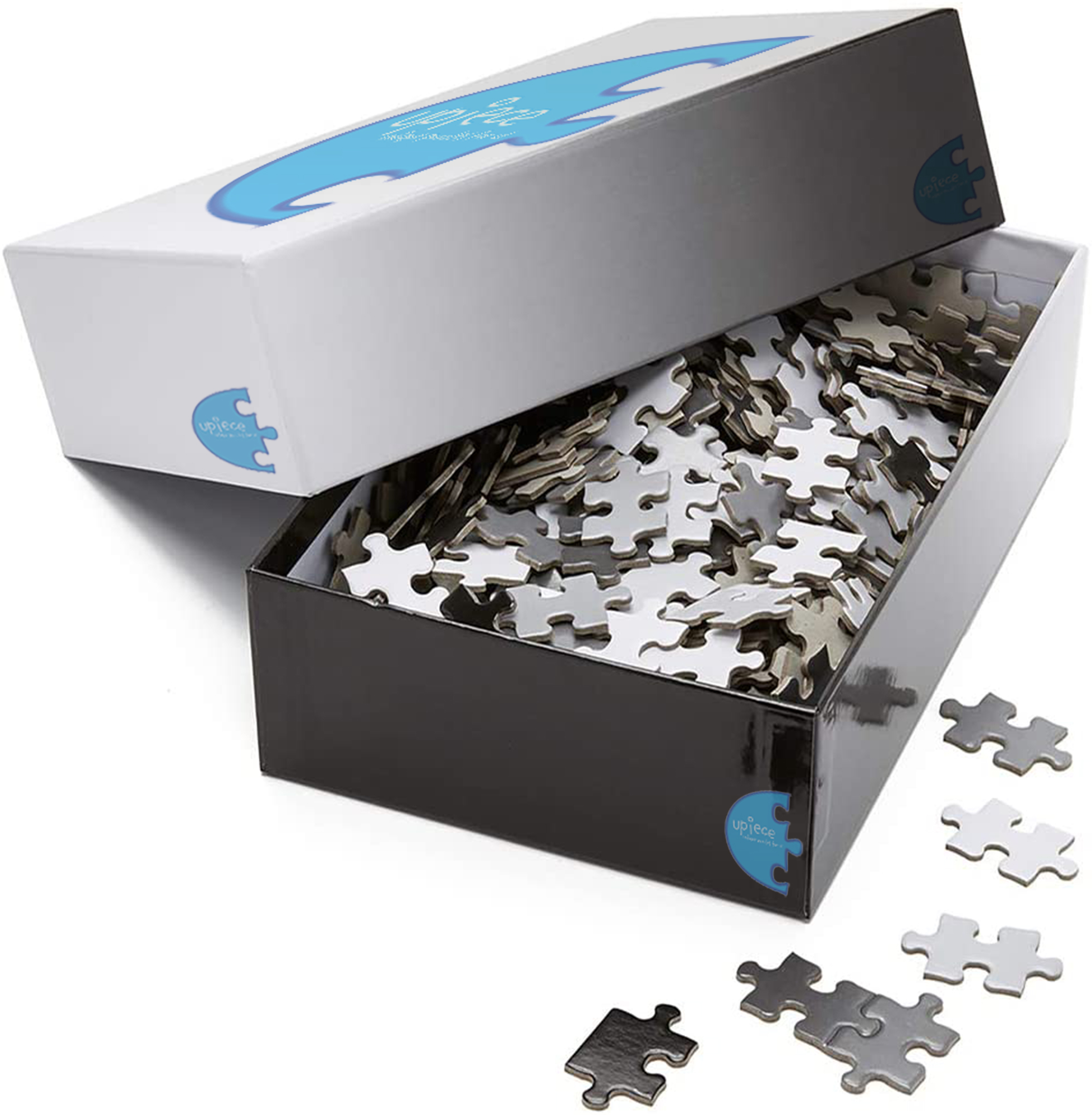
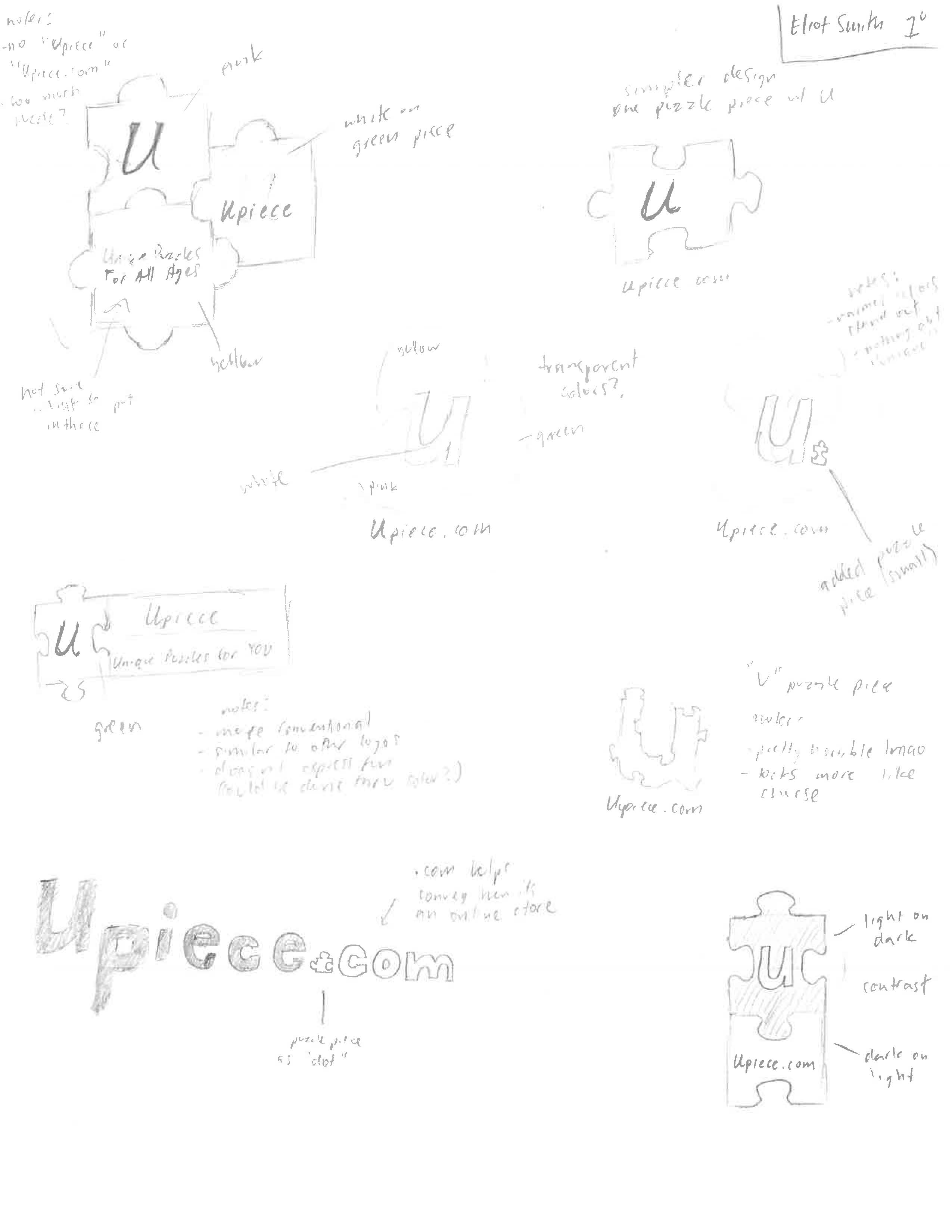
Eliot Smith
PROFILE/DESCRIPTIONUpiece is a modern puzzle brand, specializing in unique, unconventional puzzles. This can be seen in the shape of the puzzles, the shape of the puzzle pieces, and the content of the final product. Our puzzles are intended for all ages 6 and up, as the small pieces may be dangerous for younger babies. Our online store features numerous styles and shapes of puzzles; we make puzzles to fit all needs.
GOALSThe goal of the brandmark should be to convey the necessary information with ease, as well as making the design memorable and intriguing. In this case, the necessary information is that (1) it is a puzzle company, (2) it is welcoming and encouraging, and (3) the company and its puzzles are unique and different from conventional puzzle companies and their puzzles. The first goal should be fairly easy, as I plan to incorporate a puzzle piece in the design. For the second goal, the “U” in “Upiece” should help (I hope) to emphasize individuality and make the viewer understand that the company is inclusive. I believe certain colors (pink, yellow, green) will also help put the viewer at ease. Many puzzle companies use red in their logo, which is commonly associated with anger, the last thing I want the viewers to experience with puzzles. Lastly, a brief statement using the word “unique” will help give the “U” in “Upiece” another meaning. After the viewer reads it as “YouPiece”, they will read the statement and think of “UniquePiece”.
Brand Advantages: durability, variety, unique/uncommon puzzles, competitive pricing
Brand Attributes: friendly, detailed, encouraging, engaging
Brand Experience: engaging, fun, just a good ol' time