Albany High School Graphic Design
Student Showcase 2007-2022
- A Problem To Solve
- Blend Tool Poster
- Book Covers
- Editorial Clipping Mask
- Editorial Graphic
- Flatten The Curve
- Focal Points
- InDesign Spread
- Pen Tablet Sketch
- Perf Film Windows — C106
- Photoshop Brush Face
- Product Flyer
- Product+Company Mashup
- Signs & Symbols
- Something is Back!
- Spec Ad—Poster
- T-shirts & Apparel
- Text-heavy Billboard
- The Perfect Color
- Thinking With Type
- Typeface Postcard
- Volleyball Poster
- Zachary’s Poster
- Things My Friends Say
- Journalism/Security Free Choice Assignment
- AHS Front Photoshop
- A Problem To Solve
- Blend Tool Poster
- Book Covers
- Brandmark Practice
- Editorial Clipping Mask
- Editorial Graphic
- Flatten The Curve
- Focal Points
- InDesign Spread
- Pen Tablet Sketch
- Perf Film Windows — C106
- Photoshop Brush Face
- Product Flyer
- Product+Company Mashup
- Signs & Symbols
- Something is Back!
- Spec Ad—Poster
- T-shirts & Apparel
- Text-heavy Billboard
- The Perfect Color
- Thinking With Type
- Typeface Postcard
- Zachary’s Poster
- Things My Friends Say
- Journalism/Security Free Choice Assignment

Megan Loi
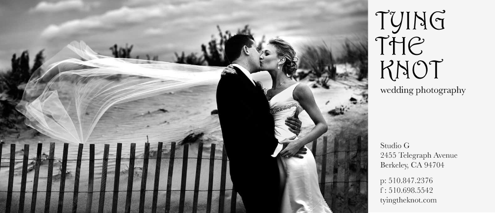
PROFILE/DESCRIPTIONThe purpose of this project was to create a bookmark to advertise the meaning of a certain company/business. We were asked to demonstrate our ability to use complementary colors by creating something that is both aesthetically pleasing and can still capture's our buyers attention. I chose to design a product flyer for "Tying The Knot", a small high-class wedding photography business in downtown LA.
GOALSWhen people see this design, I want them to think that this photography business is both classy and elegant. I chose a stereotypical 'cheesy' wedding font because I want it to look cute and dainty but still appealing to both genders. Since the image I chose was in all black and white, I decided to keep my letter types black and white to complement the picture. However, I still used the eye dropper tool to use colors from the image to use as the colors for the font fill and background. (i.e. the background white is actually the same color as her white dress).